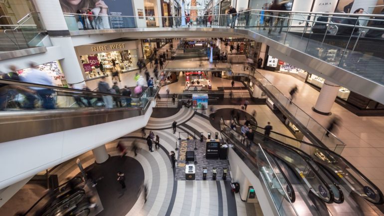
We orient ourselves very differently inside buildings: for example, through spatial arrangements or the view outside. Especially with buildings that are very complex and nested, visitors can feel like they are in a labyrinth. The contagt team tracked down the five largest building perils:
1. Everything looks the same
Everyone knows this situation: after a day of shopping we try to find our way back to the car – and desperately run down the parking decks because we no longer know where we parked. Everything looks the same! Especially when the building structure is similar, architectural properties are repeated (e.g. all corridors look the same) or no orientation point stands out, we often fail to orientate ourselves spatially.
2. Above or below
In buildings that are made up of many floors, navigation across different levels can be problematic. Sometimes we lose sight of which floor we are on, especially when the building is on a slope or when mezzanine floors make counting a little more difficult. This also applies if many escalators or stairs are next to each other or, as with elevators, only connect certain levels with each other – for example in modern shopping centers.
3. Outside and inside
If the architecture offers little reference to the outside world, visitors often feel “lost”. This is how windows help you to orientate yourself. We use the view outside as a point of reference for our own orientation. Large, modern glass surfaces stand in contrast to corridors and corridors with many closed doors, behind which rooms with windows can only be anticipated – or even underground corridors that represent an even greater challenge for our inner compass.
4. Illogical route
If certain paths or areas are blocked, this often leads to perplexity. Visitors often feel like taking a detour that doesn’t seem to make sense. For example, in a hospital where an operating room is on the direct route and which, understandably, cannot be entered. We often find these illogical routes in buildings that have gradually grown and become increasingly nested.
5. Curves and angles
Orientation difficulties often arise in buildings that have few right angles – for example, organic shapes such as curves or obtuse angles at aisle crossings. For example, if a visitor walks around the curve several times, he often mistakenly feels that he has run at a right angle. But even acute angles can lead to orientation problems. Frequently changing direction or not having a long view ahead generally carries an increased risk of getting lost.
The solution: digital wayfinding
It can be a real challenge for visitors to find their own way in a foreign environment – especially if they encounter the pitfalls mentioned above. The indoor navigation from contagt can provide the perfect remedy: By using it, guests can locate themselves at any time and conveniently display routes. This way, they quickly feel “at home” – even in the most complex buildings.

